Components
Commerce primitives that the blocks are built from.
UI 12
Small commerce primitives the blocks are built from.
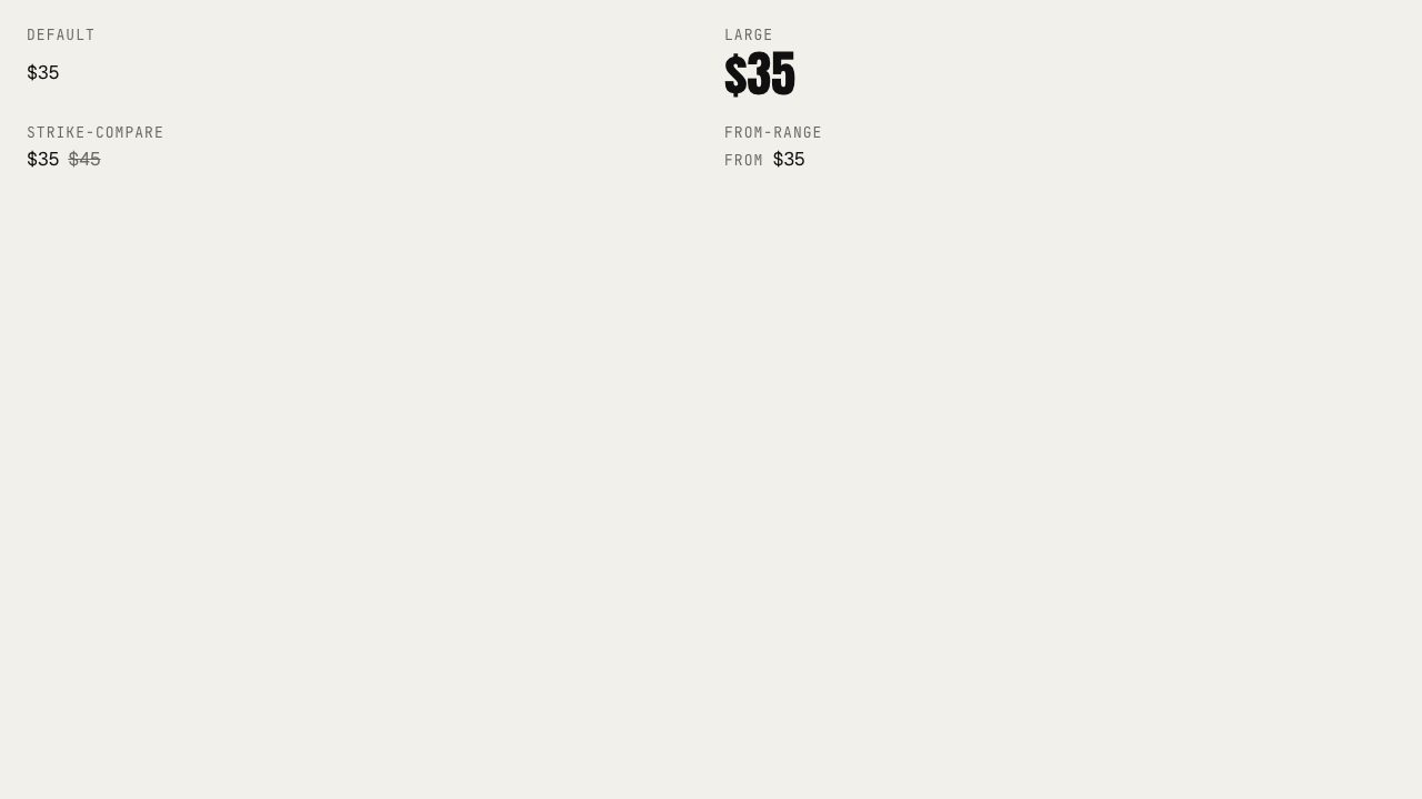
Price
UIFormatted money with default, large display, strike-through compare, and from-range variants.
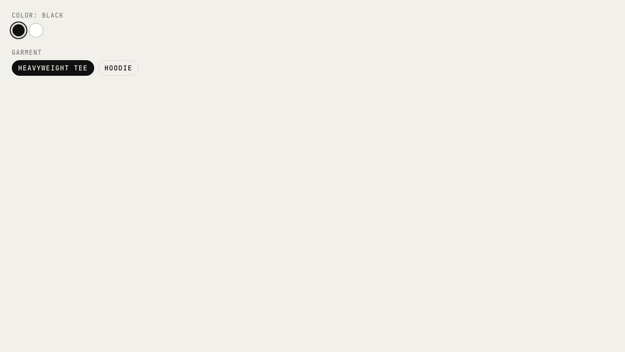
Swatch and garment pill
UIColor dots and garment pills for variant selection, built on Kobra toggle-group.
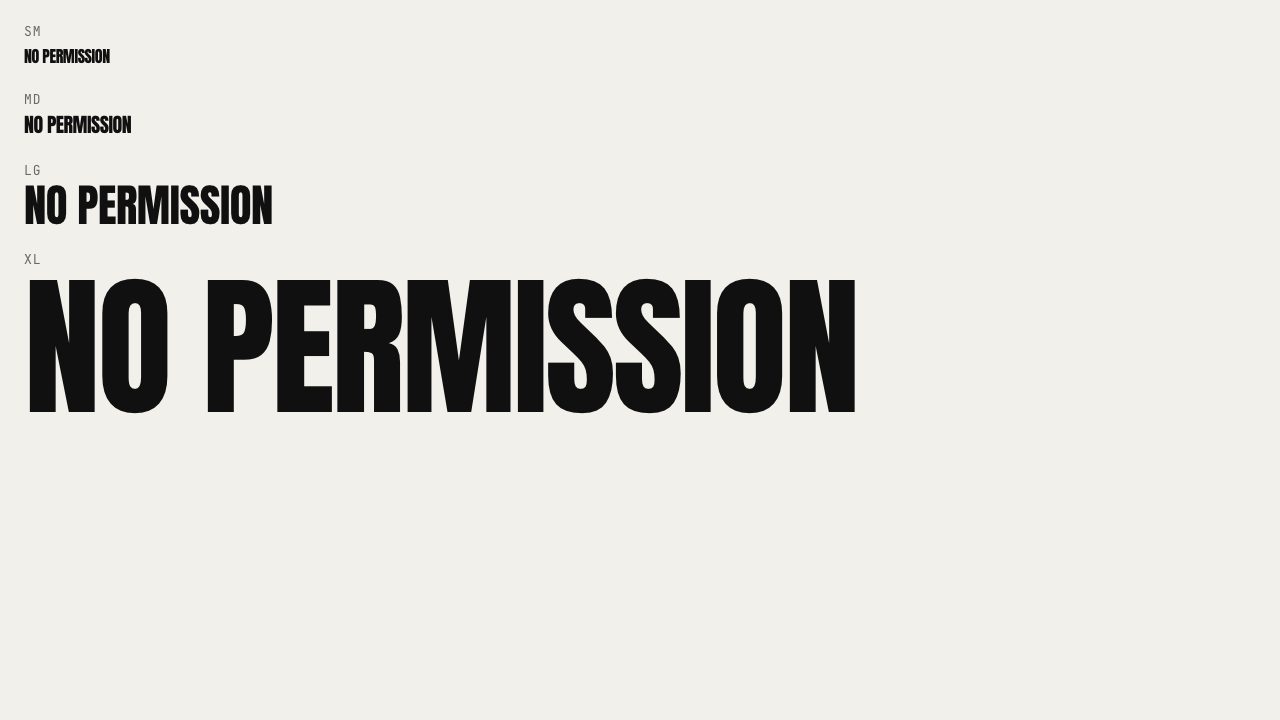
Wordmark
UIBrand name in the brand display face, four sizes up to display-xl. CAPS follow the brand token.
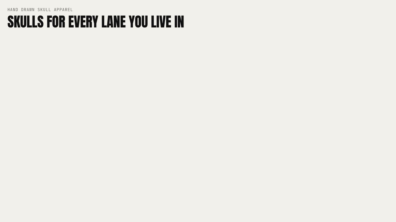
Eyebrow
UIThe .micro mono label above headlines.
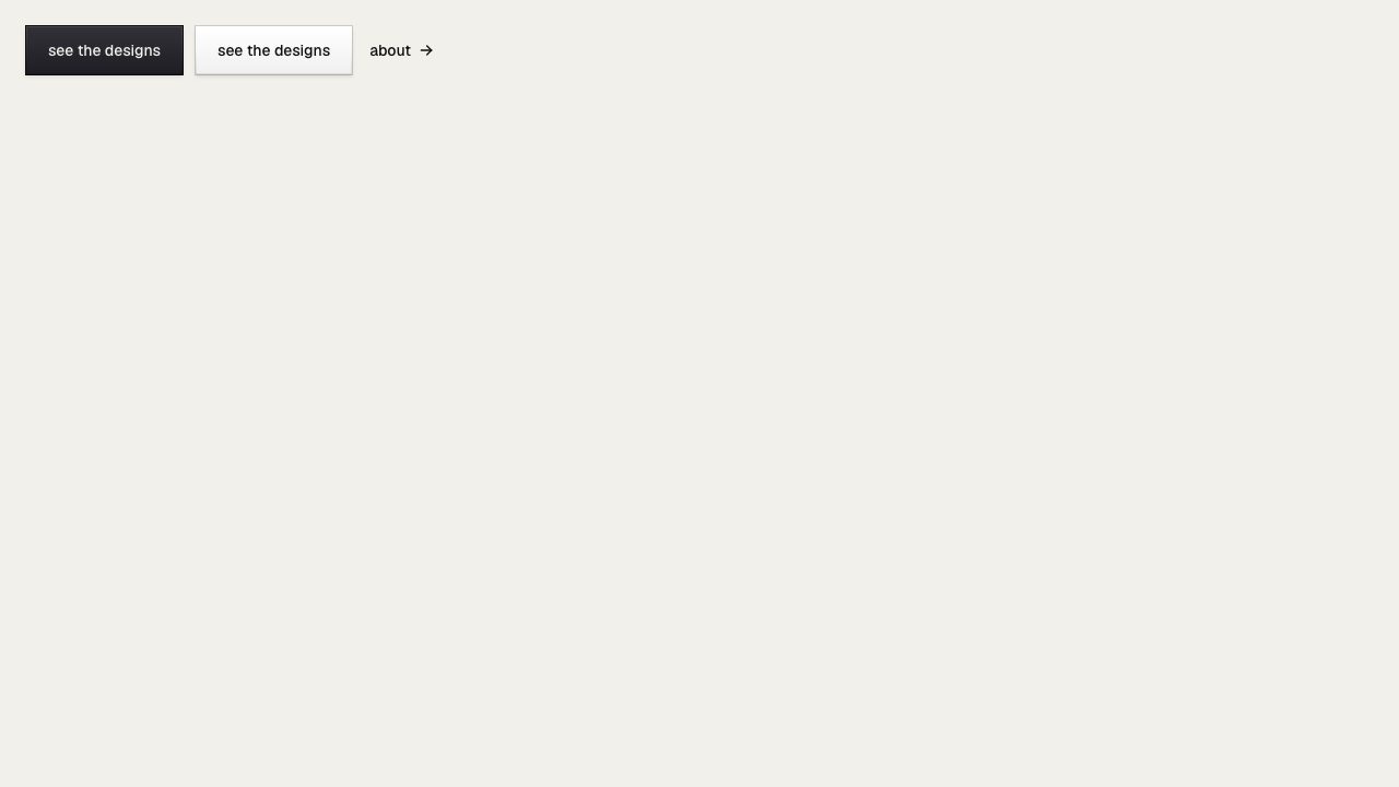
CTA button and link
UIKobra Button rendered as a link (44px hero size) plus a quiet underlined text link.
Cart button
UIBag icon button with a tabular count badge. Link or button; count is a prop.
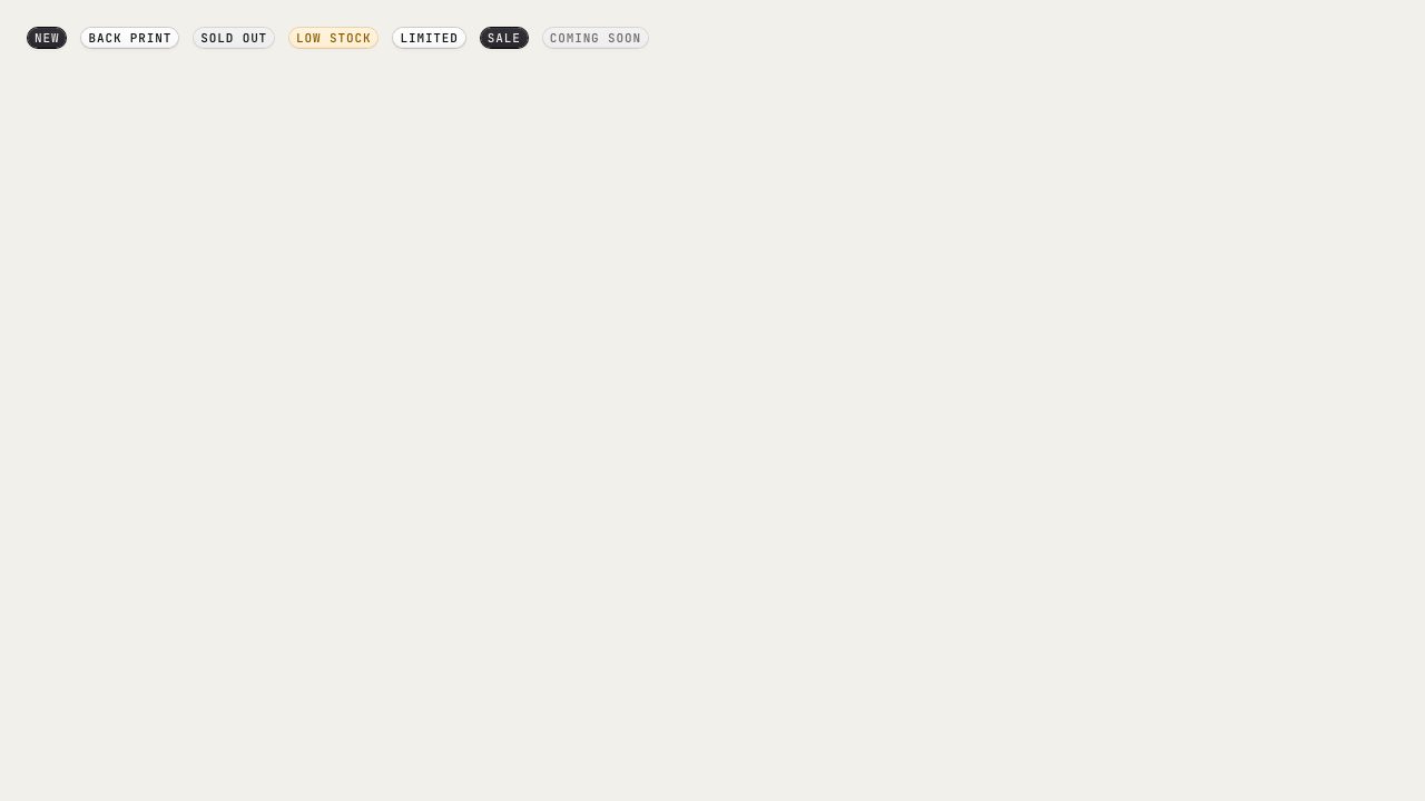
Product badge
UICommerce state badges (new, back print, sold out, low stock, limited, sale, coming soon) on Kobra badge.
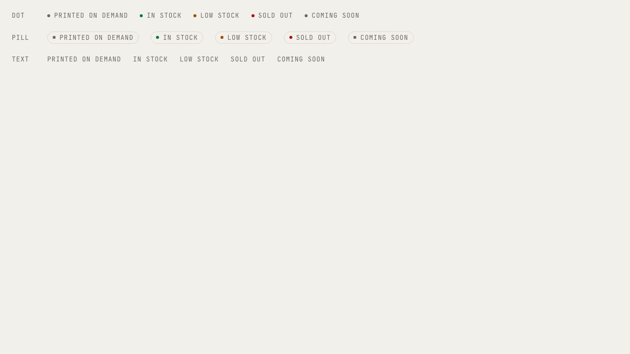
Stock marker
UIAvailability marker: printed on demand, in stock, low, sold out, coming soon. Dot, pill, or text.
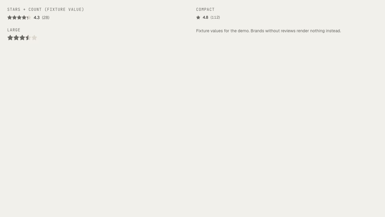
Rating
UIGray stars with fractional fill, optional value and count. Only for real review data.
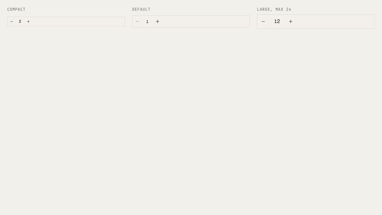
Quantity stepper
UIMinus, number, plus. Spinbutton with arrow keys, tabular digits, compact, default and large sizes.
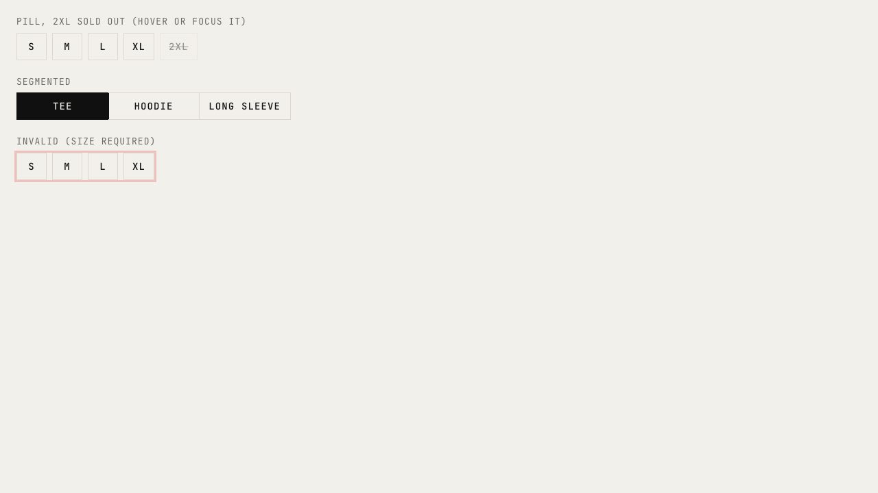
Option pills
UISize and garment pills on Kobra toggle-group: pill and segmented, struck + disabled + tooltip when unavailable.
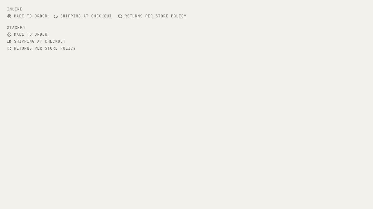
Trust row
UIA row of small mono statements with icons: made to order, shipping, returns. Neutral defaults, brand-overridable.